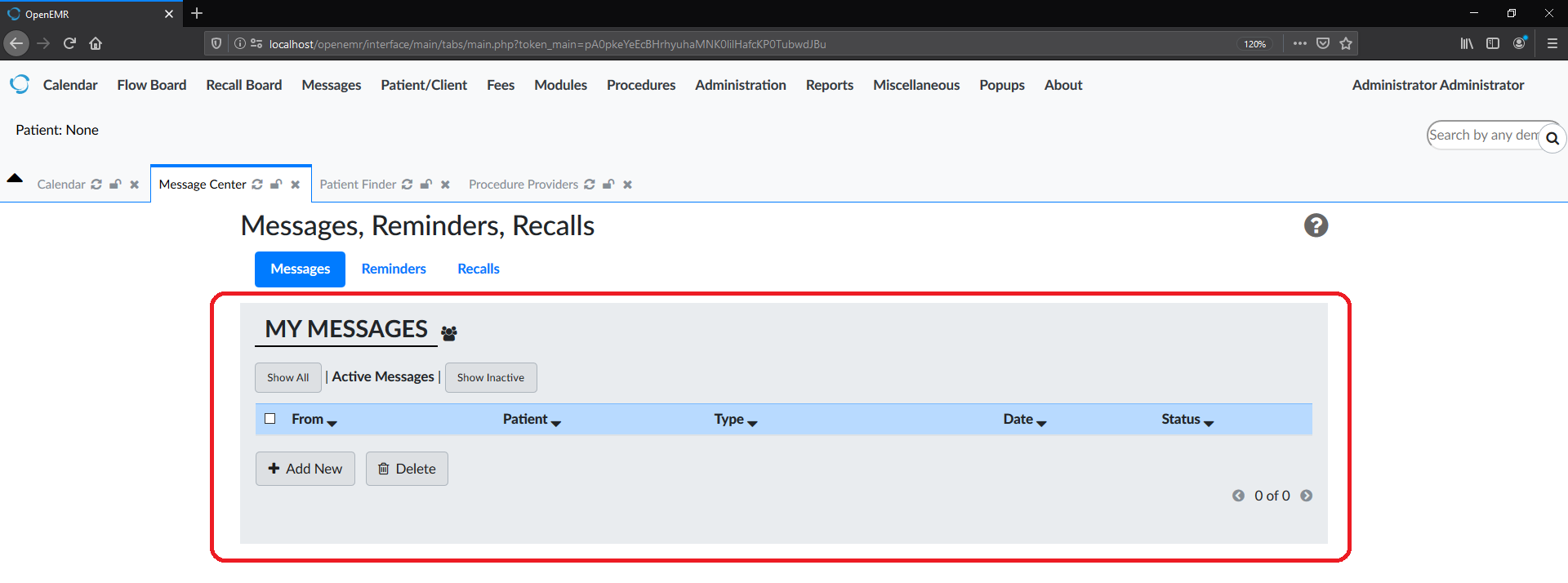
Porting over a Github Issue for discussion over here. Originally posted by Cliff Su
Describe the problem
In the current project, OpenEMR has a lot of different layouts, some pages contain outdated syntax, some pages didn’t use the Bootstrap and some pages have a strange layout.
I think we should planing a styling guideline about OpenEMR, it will be easy for us to refine the pages.
Reference link: #3145 (comment)
Describe the solution you’d like
- Design the tab’s title alignment and padding margin.

- Tab’s content using a container or container-fluid.

- Tab’s function button position

- Button color style and icon

Here are some styling guidelines that should apply for future CSS work:
- Do not use
<table>elements unless you are using them to print out data or displaying data. These should be replaced with the BS4 grid classes. - Unless the table is gonna be printed out on a printer, the
<table>element must be surrounded with a BS4<div class="table-responsive">as shown here. - Whatever you do, do not use the
<center>element for any centering of content unless there is no other alternative that CSS can offer. - Due to us transitioning away from inline/internal stylesheets, please refrain from using the
styleattribute on any element or adding the<style>element in the html header. Please add your CSS to the external SCSS found in/interface/themes. - OpenEMR originally had made the font bold by using the
boldclass. Since BS4 now has thefont-weight-boldclass, please replace any instances of this class that you find with the BS4 class. - Due to the W3C wanting people to transition to CSS more and more, please do not use (and please delete if you seem) the
<b>,<strong>,<i>,<em>,<mark>,<small>,<del>,<ins>,<sub>, or<sup>elements and use the BS4 classes as much as possible unless no other way to format it is found. - When specifying padding/margins, please use the BS4 padding and margins classes specified here.
- When setting the width/height of elements, please try to use the BS4 width/height classes specified here.
- If you want to change the display attribute of an element, try using the BS4 display classes specified here.
- Please use the BS4 colors that are listed if you plan on using colors:
primary, secondary, success, info, warning, danger, light, dark, blue, indigo, purple, pink, red, orange, yellow, teal, cyan, white, gray, gray-dark, black, gray100, gray200, gray300, gray400, gray500, gray600, gray700, gray800, gray900. These colors are changed on each theme which can be found in/interface/themes/oe-styles.
These are just a few things but there can be more
